

We all know and say that mobile is the future and we should plan for it.
In reality, it is happening now and we need to take action now. Google has already rolled out mobile-first indexing.
Did you know that 57% of users say they won’t recommend a business with a poorly-designed mobile site?
Here are some more statistics that you need to know:
- Consumers now spend more than five hours a day on their smartphones. Via Ad Week
- As of September 2018, 125 Million U.S. consumers own smartphones and 50 million U.S. Consumers own tablets. Via Outerbox
- By 2021, mobile ecommerce sales are expected to account for 54% of total ecommerce sales. Via Emarketer
Do you find that your mobile ecommerce conversion rate is lower than it should be?
In this article we will be talking specifically how to increase ecommerce mobile sales, we will cover the technical foundations your website needs to consider; user experience considerations and how you can scale up your ecommerce store for conversions.
User Experience
- Three touch test
This is a simple test that you can do. It is the same rule for desktop but when designing for mobile you should also take this into consideration.
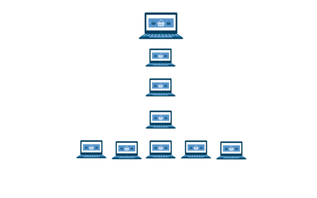
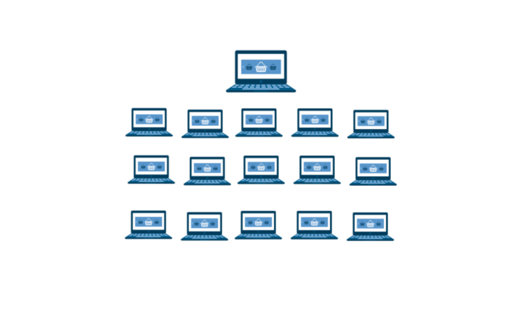
Users must be able to get to where they want to go within three clicks or less from being at the homepage. Make sure your navigation is as simple as possible.
Include breadcrumbs to your site so that users can go back to previous pages if they need to.
This is a bad example of site architecture:
This is a good example:
Let me show you an example, let’s say we want to buy a kettle from Argos, here’s what it looks like in practice:
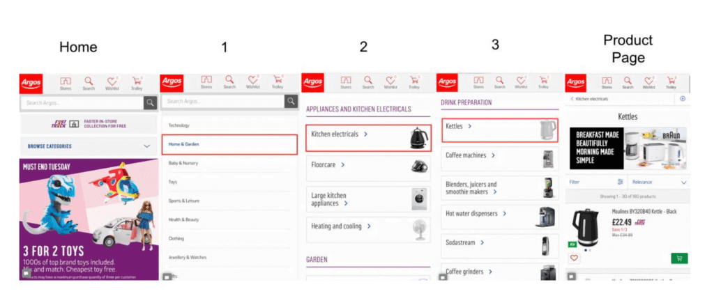
See, how easy that was?
Streamline checkout process using Apple Pay/Google Pay
Make it as easy as possible to get customers to checkout. As Apple Pay details are already in the phone it just requires the customer to type in their passcode or scan their fingerprint.
More users are browsing ecommerce stores on their mobile devices but the conversion rate is still higher on desktop rather than mobile.
My opinion for this is the speed of the checkout process. I personally do a lot of shopping online and I am prone to impulse buying. Whether it is something I’ve clicked on from a Facebook Ad or just checking back to my favourite online stores.
I impulse buy really easily, however, I do sometimes refrain from buying.
It’s not because I don’t want the product, it is because I have to get up from where I am sitting and find my wallet or I am out in public and have to try and type in my card details in whilst on the move. I also often forget my username and password for my favourite stores which stalls my mental state for actually purchasing.
With the ease of Apple Pay on my iPhone, I am much more likely to buy something. In the same way as when I am logged in to my Amazon account, the 1-Click purchase button is just screaming at me to press buy! This is great news for brands.

Leveraging Guest checkouts
As mentioned in the previous point, you must make it as simple as possible for customers to check out. While they are in the “impulse buying mode”, you shouldn’t disrupt them by making them have a long sign up process.
Grab the bare minimum details – get their address and email you can always use this later. Try and skip out the step where they have to create a username and password.
It is just an extra step that can potentially slow down the purchase speed.
You could try using social logins for people to create guest accounts, this is a clever way to harvest contact information.
Technical Aspects
Without the pillars of a solid infrastructure for your ecommerce website, you will find it very difficult to 1) be ranked in search engines 2) retain interest and attention of consumer 3) increase conversion rate.
Here are the bare essentials you need in order to your increase mobile ecommerce conversion rate.
- Responsive Design
Design Elements in % not px.
Since 2015, Google has it very clear that responsive website design is a ranking factor.
Designing in percentages will ensure that your website adjusts to different screen sizes.
Here’s what to do and what not to do:
Incorrect:
div.fullWidth {
widith: 250px ;
margin-left: auto ;
margin-right ;
}
Correct:
div.fullWidth {
width: 100% ;
}
Notice how the text and menu bar moves to fit the screen when it moves from portrait to landscape?
Don’t use flash. It is not only not good for mobile but it also slows your website down.
- Page speed
This should be your priority (along with responsiveness)
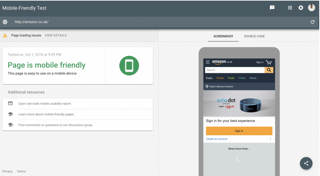
First, check your website with PageInsights and do a Mobile-Friendly test by Google to see how well it is performing. It also gives you some suggestions on how to fix them. Make a note of your score so that you can refer back to it later.

- Compress Images
Your ecommerce store will be filled with lots of product that are high resolution. This means that the image files are a lot larger so it takes longer to load.
If wish to compress images then the best tools are Smush.it and TinyPNG. They both work great with WordPress. If you don’t use WordPress then you can use TinyPNG to compress the images and then upload to your website.
- Minify CSS & Javascript
Very often, you will have code on your website that you simply don’t need. The savings may not be huge but by clearing them it can be some easy quick wins to help speed up your site an extra few milliseconds. Here are some plugins that can help you depending on your platform:
- WordPress – Autoptimize
- Shopify – Minifier
- Magento – Apptrian
- Other – minifier.org
- Disable popups
Popups on mobile are bad for both user experience and page speed. The popups have extra code in which means they increase the size of your page which doesn’t help with the loading of the web page. In terms of user experience when a user is browsing, they just want to get to what they want to without being interrupted. Popups also tend to have small “close” or “minimise” buttons which can annoy the user and can cause them to just shut the tab.
- Disable unused plugins
If you have any plugins in your CMS that you don’t use then you should disable them. Again, this increases file size on your website. All of these small efforts add up and you will see increases in page load speed.
- Optimise for Voice search
It is said that by 2020 30% of all web searches will be done without a screen.
First of all, research the long tail keywords to optimise your site for. To find some keywords go to AnswerThePublic and type in a keyword.
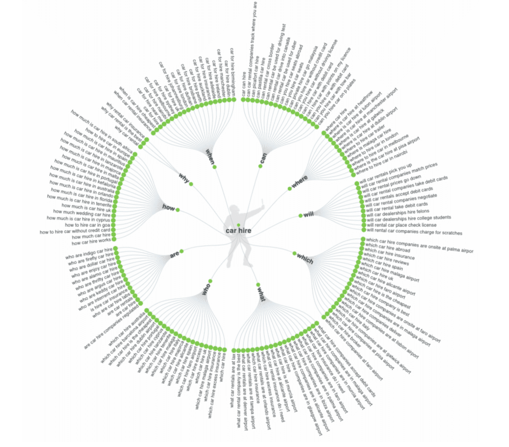
This gives you tonnes of suggestions and you can export them into a spreadsheet.
Each type of query signals different intent to taking action. At stage one people are doing broad searches such as “What car hire companies to accept debit cards”. At stage four, people are actually asking where they can hire cars from they would ask questions such as “Car hire in London”.
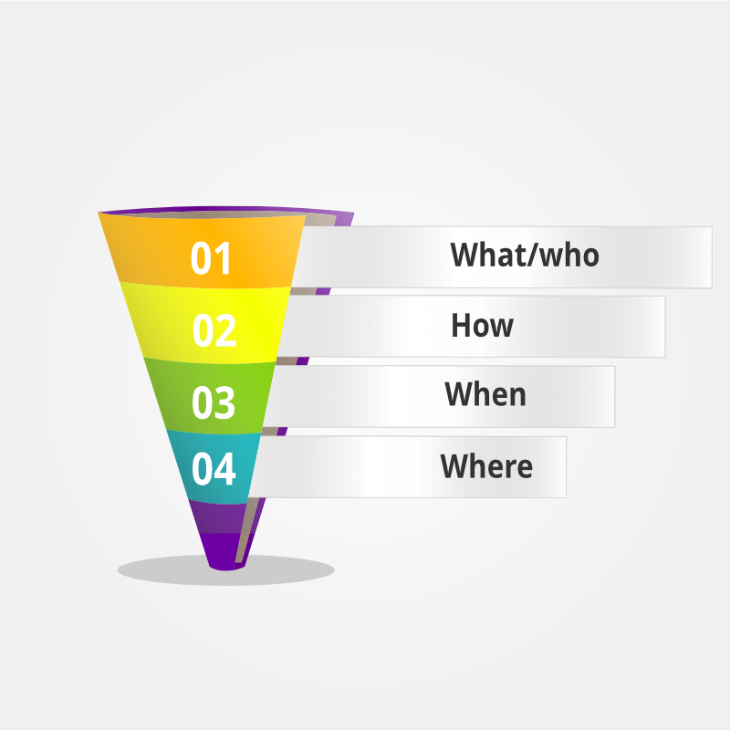
At the fourth stage, you must be localised for local search.
When going through your on-page SEO, including the location(s) in your body text, internal links and anchor text, meta description and title tags. Also, mention any landmarks around where you are based.
Be sure to claim your Google My Business listing and fill in the correct data. List yourself in local and national directories. The more places you have your Name, Address, Phone Number, Email Address and Email Address, the more it signals that you are legitimately in that location. If you can write short bios and hyperlink text then hyperlink text directly to the specific pages you are trying to rank for.
Suggested post: How to Optimise for Voice Search
Scaling up
Now that you have some ideas about how to optimise your mobile ecommerce site, hopefully you have implemented them and can move on to the next step. Now we will talk about how to increase the conversion rate for your mobile ecommerce store.
- Google Analytics
When on mobile, users are on all different types of devices with different screen sizes. They may also be on the go, walking somewhere or on a commute on a bumpy train. People have different finger and thumb sizes, you must accommodate for all of these factors.
Have a look through your Google Analytics and see what size screens have the highest bounces rates or the most amount of page views with the least conversions.
Go to the left-hand menu under Overview and click Mobile -> Devices -> Screen Resolution.
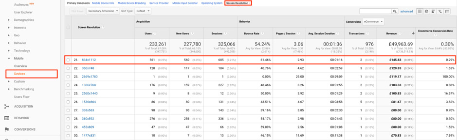
Look for factors such as high volumes of traffic but low conversions or high bounce rate and low conversions. This could mean that this website is not optimised for that sized screen.
You can click through on the screen size and find out which device it is. Physically test it out yourself to see what may be the potential issue. Sometimes numbers on a screen aren’t enough to see the issues so buy or borrow the devices.
- A/B split testing
Here are some ideas of elements that you can add in and see how it effects your conversion rate.
Countdown timer – Create a sense of urgency. Have a limited time offer that runs out each day. Split test to first see if it works or not and then experiment to see what the golden countdown number is.
- Live chat
You want people to stay on your website for as long as possible. If people have concerns about something then they are likely to bounce off. If they see a support email address or number then they’re likely to think that they’ll never get a response. However, if you have a live chat feature, this can be good for the customer as they get their questions answered quickly. This helps decrease the bounce rate and it also helps with the user’s experience of the website.
To be smart, add in fields so that you can yield email addresses before you start. I recommend using these live chat providers:
- Product videos
I know that content creation is time-consuming and expensive however it can pay in the long term. Video can increase your conversion rate by between 64-85%, that’s huge!
To start with, you don’t need to add videos for every product, find out your top 8-10 products and add videos to 4/5 of them and measure the how many conversions each one gets with and without video.
- 360-degree images
Test out whether 360-degree images work for your store. People very often like to see products from all angles and that isn’t always completely possible from a photograph. This may be a costly process but still consider this option. You can split test between video/360 degree images. If you can’t manage to get 360-degree images then focus on getting the best possible images you can.
- Cross-platform retargeting
There are lots of ways that people could have visited your ecommerce site initially, it could be through social, press releases, organic search, AdWords, YouTube, the list goes on.
The sad part about all of this traffic is that up to 98% of visitors will not convert first time.
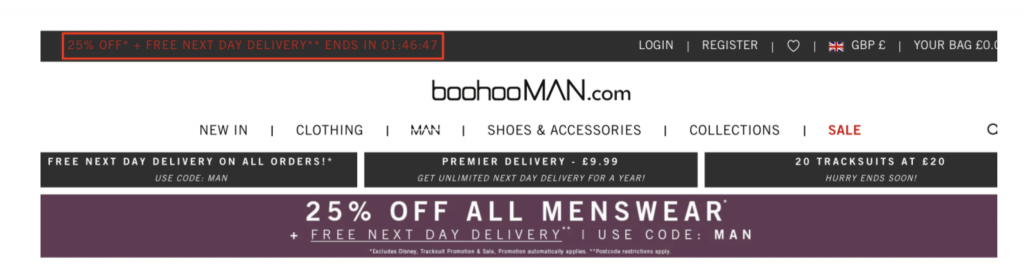
The rule of seven states that consumers must see your brand at least seven times before you they can properly trust you. There are plenty of opportunities to do this, display ads, Facebook advertising and more.
The key is to make the placement of these touchpoints as dynamic as possible. The use of Instagram stories has become increasingly popular.
Suggested post: 9 Quick Tips on Writing Quality Facebook Ads
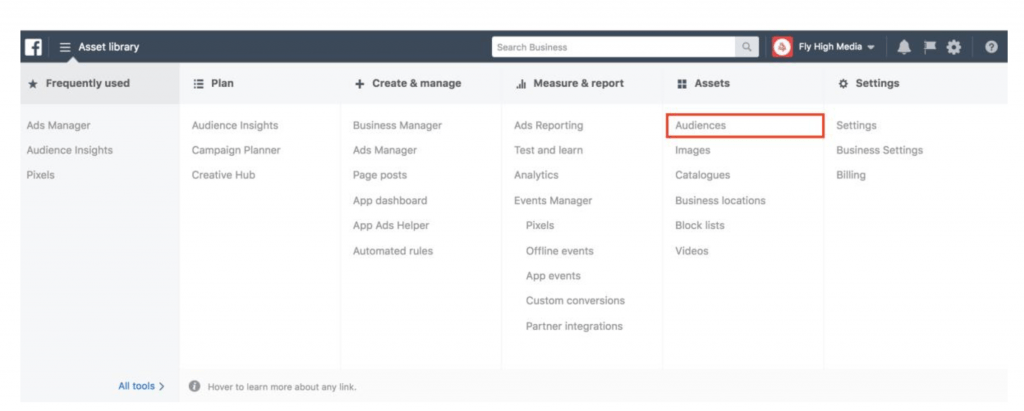
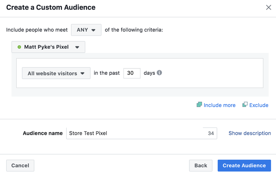
To set up a retarget ad on Facebook you must make sure that you have the Facebook Pixel installed correctly.
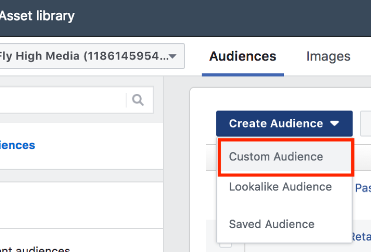
After you have installed the Pixel, go to Business Manager and click Audiences.
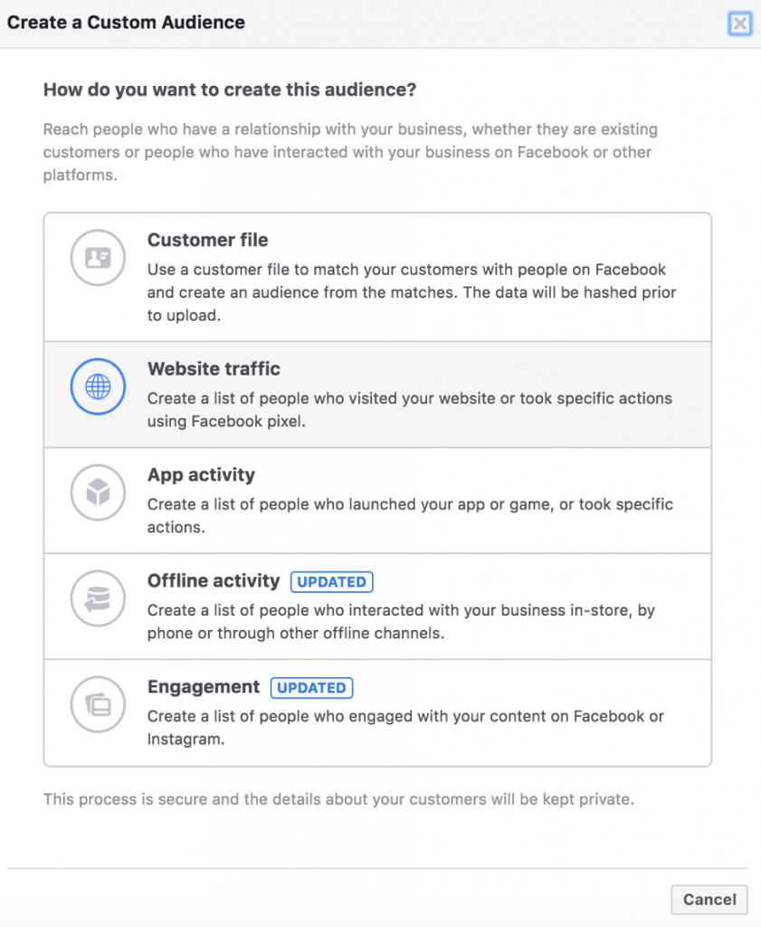
Then click custom audiences.
Select Website traffic
Name your audience, then click create! This will track anybody who has visited your website in the past 30 days.
Here are some Facebook Ad ideas:
- Videos of products
- Discount codes
- Display customer reviews
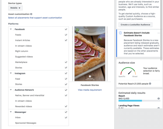
To retarget to people on mobile, when you are building your ad simply just need to change the Device type to Mobile and then choose where you would like your Ads to be shown.
So there it is! Which part have you found the most interesting? What did we miss out?
Leave a comment to let us know what you think!
If you are further interested in SEO Services then book a free discovery call.